[01]
[02]
Brandmarks
( Indentity system )
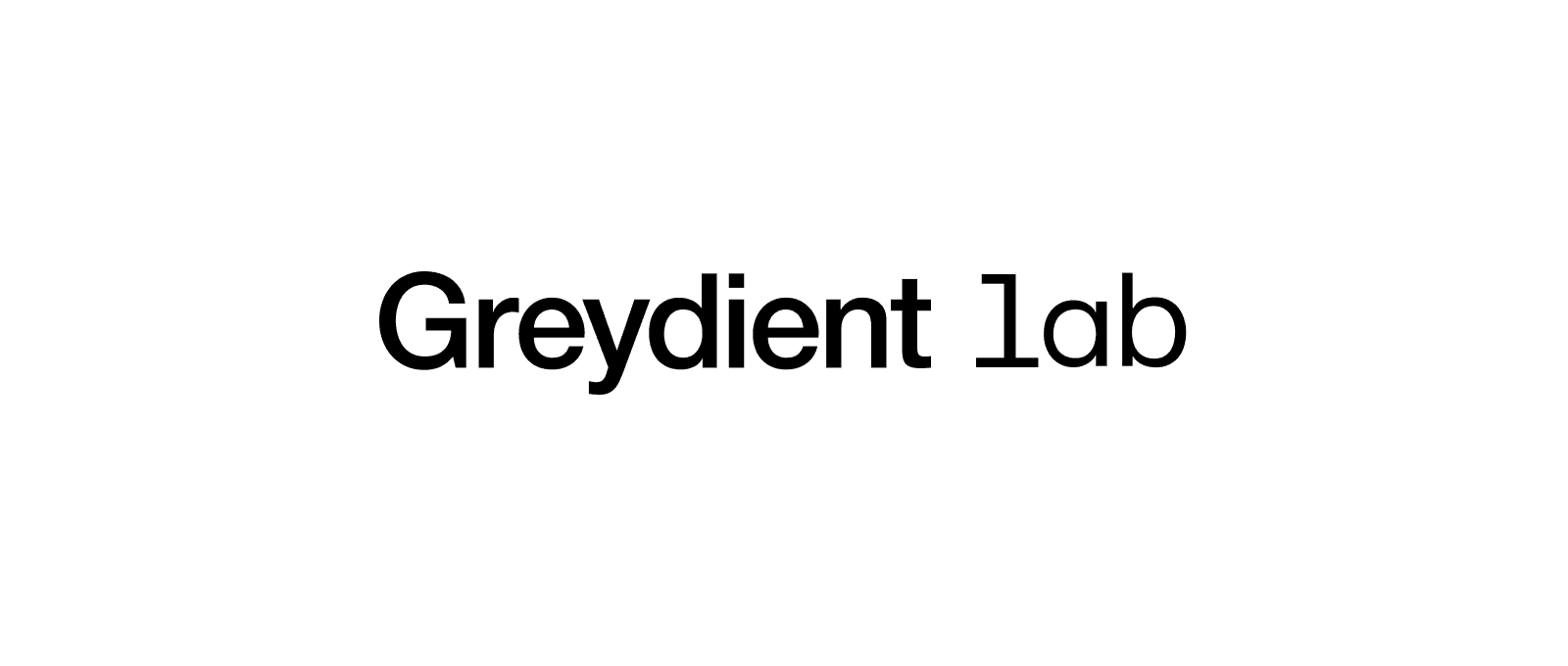
LOGOTYPE
The Greydient Lab logo is iconic and distinctly ours. Its unique blend of sans-serif and monospace fonts visually represents the seamless integration of design and engineering that defines our work. This foundation reinforces our brand leadership, confidence, and reliability.
( Logotype )
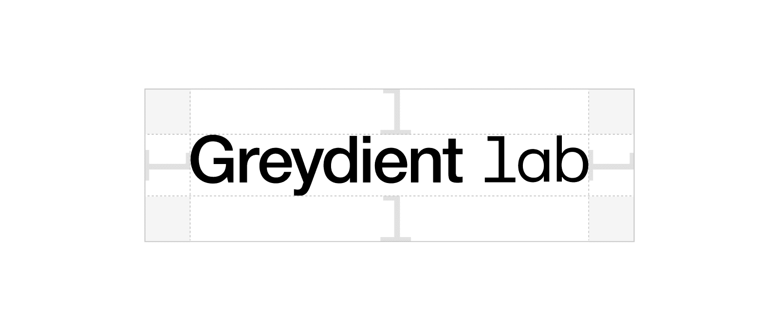
CLEAR SPACE
We’re a confident brand. We never crowd our logos and always give them room to breathe and stand out. The clear space around the logotype is the height of the letter "L."

( Logotype )
MINImum size
To maintain legibility and brand integrity, the logo must never be displayed below the minimum size specified. This ensures clarity across all applications, from print to digital.
When scaling the logo, always maintain its proportions to prevent distortion.

( Logotype )
COlour format
To maintain legibility and brand integrity, the logo must never be displayed below the minimum size specified. This ensures clarity across all applications, from print to digital.
When scaling the logo, always maintain its proportions to prevent distortion.

( Logotype )
Misuses
To keep the logotype consistent, do not:
Stretch or warp the logo
Change the logo colour
Apply stroke in anyway
Use the logo as a mask
Apply any special effects
Break the words
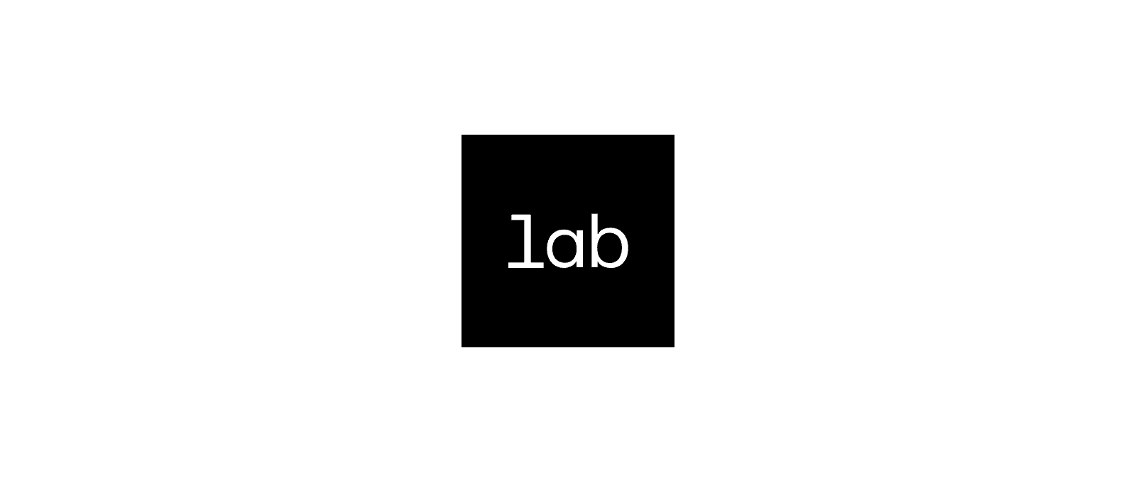
Symbol
The Greydient Lab symbol mark is a recognizable distillation of our identity. Its precise square frame and "lab" text powerfully convey focused innovation and exploration. This mark excels in limited spaces, ensuring our core message of ingenuity always shines through.
( SYMBOL )
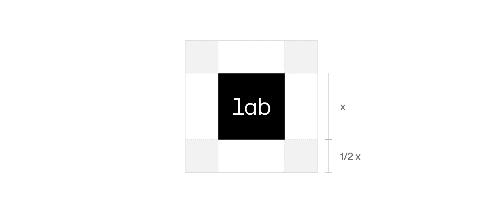
CLEAR SPACE
We’re a confident brand. We never crowd our logos and always give them room to breathe and stand out. The clear space around the logotype is the height of the letter "L."
( symbol )
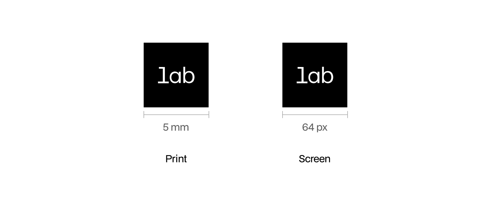
MINIMUMSIZE
We’re a confident brand. We never crowd our logos and always give them room to breathe and stand out. The clear space around the logotype is the height of the letter "L."
( Symbol )
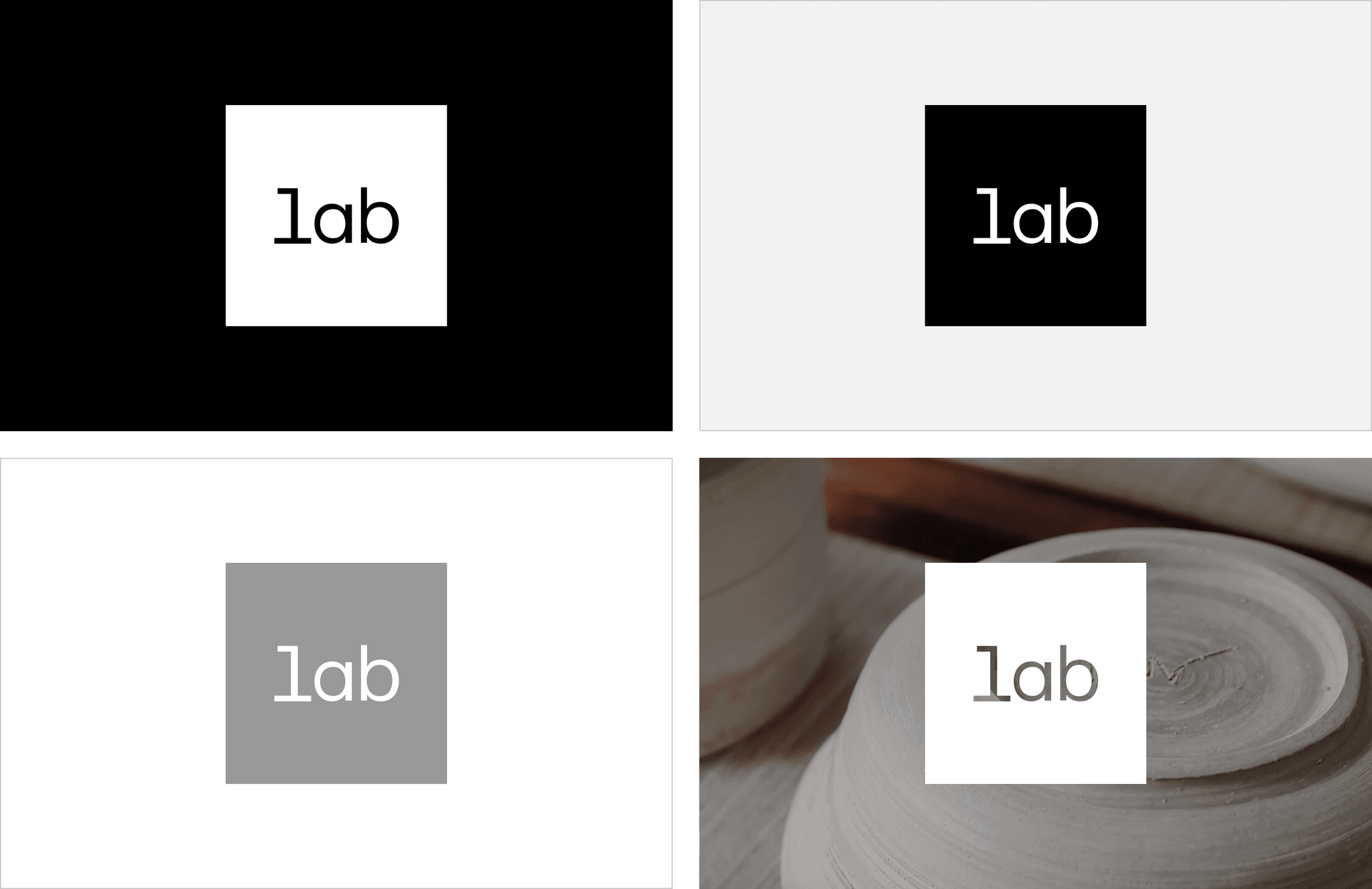
COlour format
To maintain legibility and brand integrity, the logo must never be displayed below the minimum size specified. This ensures clarity across all applications, from print to digital.
When scaling the logo, always maintain its proportions to prevent distortion.
( SYMBOL )
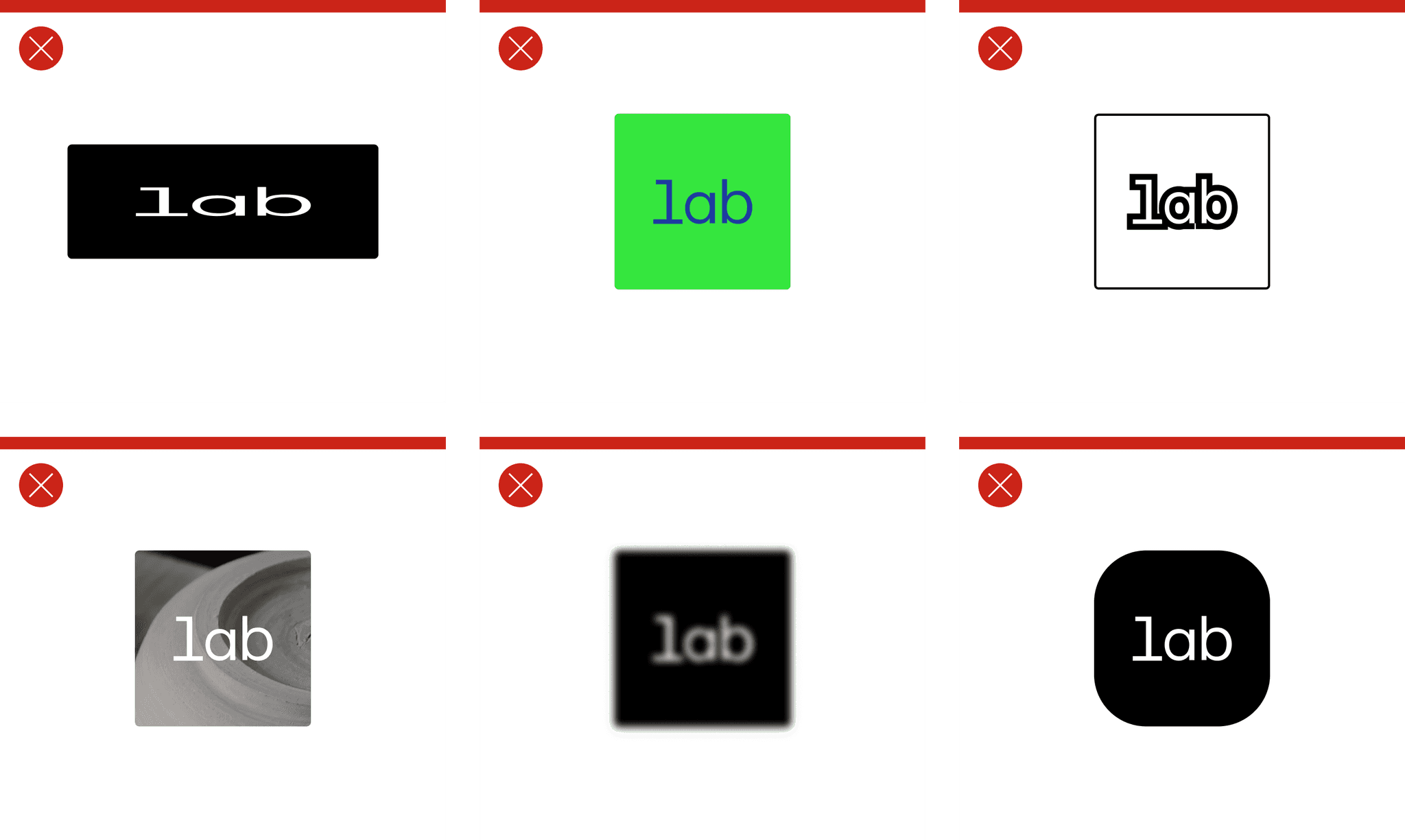
Misuses
To keep the logotype consistent, do not:
Stretch or warp the logo
Change the logo colour
Apply stroke in anyway
Use the logo as a mask
Apply any special effects
Round the symbol's corners
© 2025 Greydient Lab
—
All rights reserved