[01]
[02]
Typography
( Indentity system )
Primary typeface
BDO GROTESK
ABCDEFGHIJKLMNOPQRSTUVWXYZ
abcdefghijklmnopqrstuvwxyz
1234567890!@#$%^&*()
SECONDARY typeface
GEIST MONO
ABCDEFGHIJKLMNOPQRSTUVWXYZ
abcdefghijklmnopqrstuvwxyz
1234567890!@#$%^&*()
Brand typeface
BDO Grotesk is Greydient Lab’s primary typeface, blending modern minimalism with bold character. Its clean, geometric forms ensure clarity and consistency, reflecting our user-centric ideology.
Geist Mono serves as a secondary typeface. Its monospaced structure brings digital edge and technical precision, making it ideal for supporting roles like annotations, UI labels, and captions.
EXPAND
Usage
Typesettings
Sample
Hero title
Weight
Leading
Tracking
Size
Case
Medium
100%
-4%
7.5X
UC
Headline 1
Default title
Weight
Leading
Tracking
Size
Case
Medium
100%
-4%
6X
UC
Headline 2
Section title
Weight
Leading
Tracking
Size
Case
Medium
100%
-3%
2.7X
UC
Headline 3
Decorative line
Weight
Leading
Tracking
Size
Case
Medium
120%
-2.5%
2X
TC
Headline 4
Article headline
Weight
Leading
Tracking
Size
Case
Medium
120%
-2%
1.6X
TC
Headline 5
Hero subheads
Weight
Leading
Tracking
Size
Case
Medium
115%
-2%
1.6X
UC
Subhead large
Default subhead
Weight
Leading
Tracking
Size
Case
Medium
135%
-2%
1.3X
UC
Subhead large
Article subhead
Weight
Leading
Tracking
Size
Case
Medium
130%
-2%
1.1X
UC
Subhead small
Hero paragraph
Weight
Leading
Tracking
Size
Case
Medium
135%
-1%
1.3X
SC
Body Large is designed for content that requires both clarity and ease of reading in short periods.
Default Paragraph
Weight
Leading
Tracking
Size
Case
Regular
135%
-1%
X
SC
The Body Medium is perfect for content that needs to be concise yet readable. Its moderate font size and carefully calibrated line height make it ideal for smaller blocks of text, such as descriptions.
Article Paragraph
Weight
Leading
Tracking
Size
Case
Regular
160%
0%
0.9X
SC
The Body Medium is perfect for content that needs to be concise yet readable. Its moderate font size and carefully calibrated line height make it ideal for smaller blocks of text, such as descriptions.
UI Label, Detail
Weight
Leading
Tracking
Size
Case
Regular
135%
0%
X
UC
LABEL
Legal, Note
Weight
Leading
Tracking
Size
Case
Regular
135%
-1%
0.8X
UC
FOOTNOTE
( BRAND TYPEFACE )
typesettings
Our typographic system follows a consistent scale where ‘Body Medium’ is defined as X. Each style scales from this base using defined sizing, spacing, and casing. UC stands for Uppercase, SC for Sentence Case, and TT for Title Case.
Expand the chart on the left to view the full typographic scale guide.

( Brand typeface )
Applications
Our typography is designed for clarity, impact, and balance. For better hierarchy, body text colour will be Mid Grey on White / Off White backgrounds and Light Grey on Black background.
It is important to limit the number of type styles to 4 or less in one view for a clear and concise design.
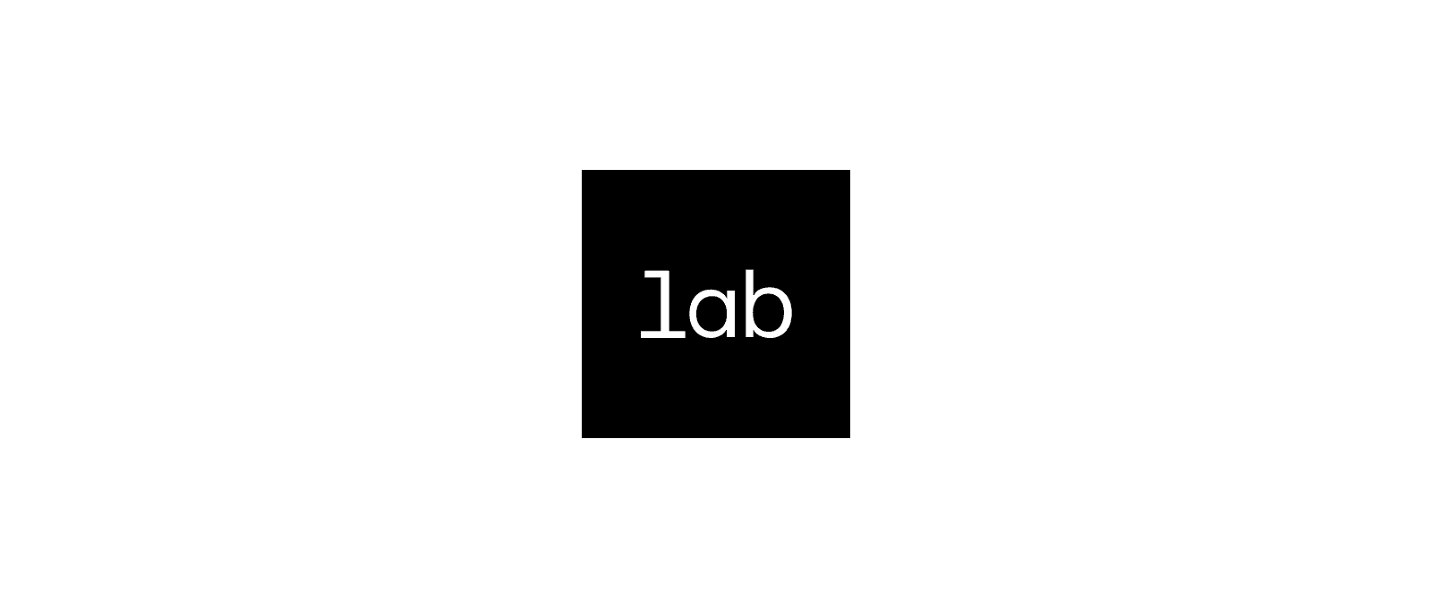
Symbol
The Greydient Lab symbol mark is a recognizable distillation of our identity. Its precise square frame and "lab" text powerfully convey focused innovation and exploration. This mark excels in limited spaces, ensuring our core message of ingenuity always shines through.
( SYMBOL )
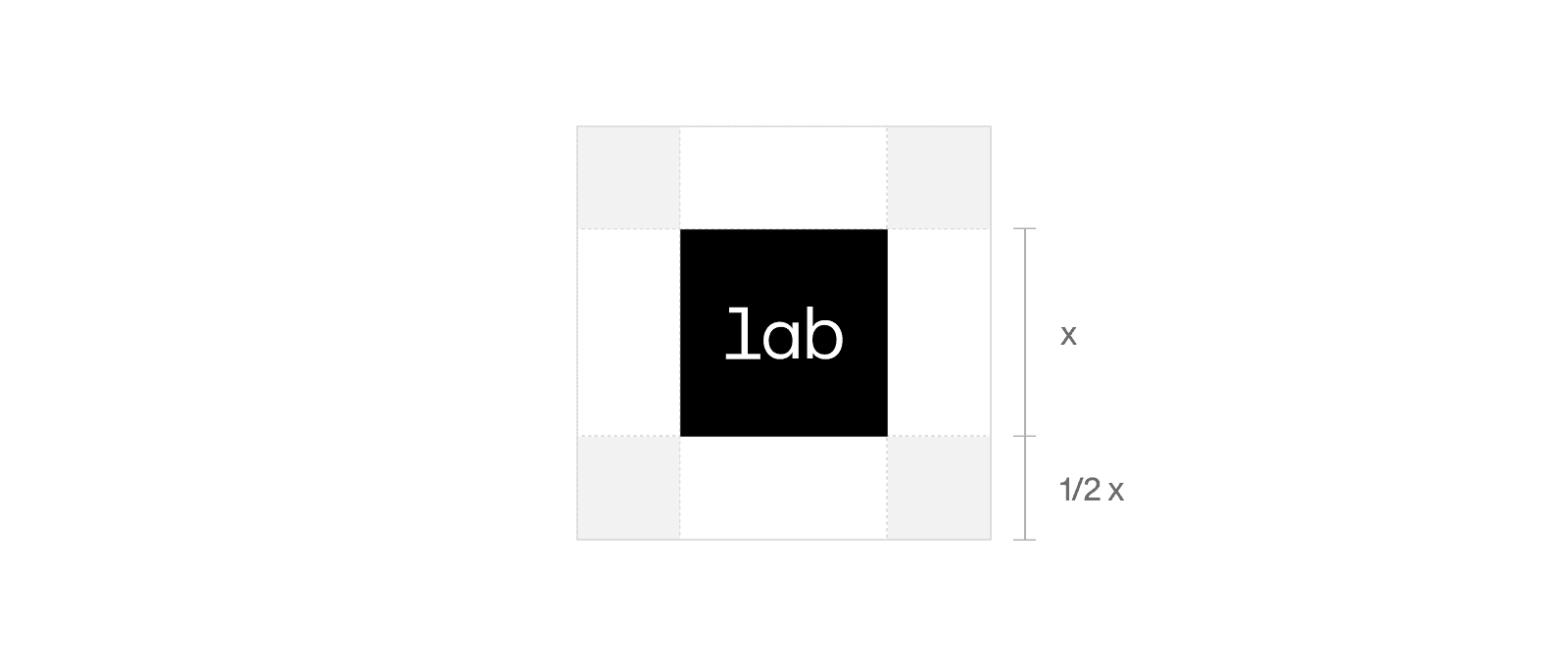
CLEAR SPACE
We’re a confident brand. We never crowd our logos and always give them room to breathe and stand out. The clear space around the logotype is the height of the letter "L."
( symbol )
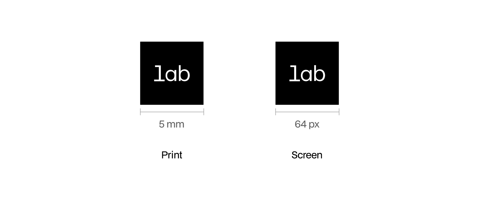
MINIMUMSIZE
We’re a confident brand. We never crowd our logos and always give them room to breathe and stand out. The clear space around the logotype is the height of the letter "L."
© 2025 Greydient Lab
—
All rights reserved